WooCommerce Bootstrap5 site header

CHALLENGE: prepare the site header with a menu, a cart, my account links, a search form and a top nav
SOLUTION: enqueue bootstrap5 styles, the headroom script, add a custom menu walker and a mobile menu
Implementing the WordPress main navigation header can be a time-consuming task. There are multiple breakpoints and the mobile menu should be compatible with all popular devices. We’re going to use the newest version of a popular Frontend Framework: Bootstrap version 5. By applying proper CSS classes, most things will be styled out-of-the-box. Our header will be compatible with the WooCommerce plugin. As most online shops, ours will have a logo, a Product Search Form, a shopping cart and a user menu. As a starting point, we will use a minimalistic WP theme: twentytwentyone.
Enqueuing scripts and styles
CDN will be used to add the needed scripts and styles. First, we need to have CSS for Bootstrap 5.1.3. Javascript BS5 bundle includes core Bootstrap functions and a Popper script for handling the user dropdown menu. Line-awesome icons are responsible for displaying Cart and User icons. Headroom Javascript will improve mobile usability. Lastly, style.css for applying custom styles and main.js for headroom initialization will be enqueued.
// functions.php
$ct_assets_version = 5;
function ct_add_bs5_assets(){
    global $ct_assets_version;
    // load main css file
    wp_enqueue_style( 'ct_theme-style', get_template_directory_uri() . '/assets/css/style.css', '', $ct_assets_version );
    wp_enqueue_style( 'ct_theme-icons', 'https://cdnjs.cloudflare.com/ajax/libs/line-awesome/1.3.0/line-awesome/css/line-awesome.min.css', '', $ct_assets_version );
    wp_enqueue_style( 'ct_theme-bs5', 'https://cdn.jsdelivr.net/npm/bootstrap@5.1.3/dist/css/bootstrap.min.css', '', $ct_assets_version );
    // bootstrap 5 with Popper
    wp_enqueue_script( 'ct_theme-bs5-js', 'https://cdn.jsdelivr.net/npm/bootstrap@5.1.3/dist/js/bootstrap.bundle.min.js', array(), $ct_assets_version, true );
    // headroom js script
    wp_enqueue_script( 'ct_theme-headroom-js', 'https://cdnjs.cloudflare.com/ajax/libs/headroom/0.12.0/headroom.min.js', array(), $ct_assets_version, true );
    // load main js file
    wp_enqueue_script( 'ct_theme-main-js', get_template_directory_uri() . '/assets/js/main.js', array(), $ct_assets_version, true );
}
add_action( 'wp_enqueue_scripts', 'ct_add_bs5_assets' );
WP menu Bootstrap markup
To get all WordPress menus styled with Bootstrap default styles, we have to change the markup of nav items. This can be done by adding a new menu walker in PHP.
/**
 * Include Bootstrap menu markup walker
 */
// functions.php
require 'inc/bs5_nav_walker.php';
Bootstrap5 wp nav menu walker will globally apply proper CSS classes to the dropdown and nav menu items. The benefit of this is that we don’t have to write additional styles to have everything styled.
<?php
// /inc/bs5_nav_walker.php
// bootstrap 5 wp_nav_menu walker
// https://github.com/AlexWebLab/bootstrap-5-wordpress-navbar-walker
class bootstrap_5_wp_nav_menu_walker extends Walker_Nav_menu
{
    private $current_item;
    private $dropdown_menu_alignment_values = [
        'dropdown-menu-start',
        'dropdown-menu-end',
        'dropdown-menu-sm-start',
        'dropdown-menu-sm-end',
        'dropdown-menu-md-start',
        'dropdown-menu-md-end',
        'dropdown-menu-lg-start',
        'dropdown-menu-lg-end',
        'dropdown-menu-xl-start',
        'dropdown-menu-xl-end',
        'dropdown-menu-xxl-start',
        'dropdown-menu-xxl-end'
    ];
    function start_lvl(&$output, $depth = 0, $args = null)
    {
        $dropdown_menu_class[] = '';
        foreach($this->current_item->classes as $class) {
            if(in_array($class, $this->dropdown_menu_alignment_values)) {
                $dropdown_menu_class[] = $class;
            }
        }
        $indent = str_repeat("\t", $depth);
        $submenu = ($depth > 0) ? ' sub-menu' : '';
        $output .= "\n$indent<ul class=\"dropdown-menu$submenu " . esc_attr(implode(" ",$dropdown_menu_class)) . " depth_$depth\">\n";
    }
    function start_el(&$output, $item, $depth = 0, $args = null, $id = 0)
    {
        $this->current_item = $item;
        $indent = ($depth) ? str_repeat("\t", $depth) : '';
        $li_attributes = '';
        $class_names = $value = '';
        $classes = empty($item->classes) ? array() : (array) $item->classes;
        $classes[] = ($args->walker->has_children) ? 'dropdown' : '';
        $classes[] = 'nav-item';
        $classes[] = 'nav-item-' . $item->ID;
        if ($depth && $args->walker->has_children) {
            $classes[] = 'dropdown-menu dropdown-menu-end';
        }
        $class_names =  join(' ', apply_filters('nav_menu_css_class', array_filter($classes), $item, $args));
        $class_names = ' class="' . esc_attr($class_names) . '"';
        $id = apply_filters('nav_menu_item_id', 'menu-item-' . $item->ID, $item, $args);
        $id = strlen($id) ? ' id="' . esc_attr($id) . '"' : '';
        $output .= $indent . '<li ' . $id . $value . $class_names . $li_attributes . '>';
        $attributes = !empty($item->attr_title) ? ' title="' . esc_attr($item->attr_title) . '"' : '';
        $attributes .= !empty($item->target) ? ' target="' . esc_attr($item->target) . '"' : '';
        $attributes .= !empty($item->xfn) ? ' rel="' . esc_attr($item->xfn) . '"' : '';
        $attributes .= !empty($item->url) ? ' href="' . esc_attr($item->url) . '"' : '';
        $active_class = ($item->current || $item->current_item_ancestor) ? 'active' : '';
        $nav_link_class = ( $depth > 0 ) ? 'dropdown-item ' : 'nav-link link-dark';
        $attributes .= ( $args->walker->has_children ) ? ' class="'. $nav_link_class . $active_class . ' dropdown-toggle" data-bs-toggle="dropdown" aria-haspopup="true" aria-expanded="false"' : ' class="'. $nav_link_class . $active_class . '"';
        $item_output = $args->before;
        $item_output .= '<a' . $attributes . '>';
        $item_output .= $args->link_before . apply_filters('the_title', $item->title, $item->ID) . $args->link_after;
        $item_output .= '</a>';
        $item_output .= $args->after;
        $output .= apply_filters('walker_nav_menu_start_el', $item_output, $item, $depth, $args);
    }
}
Main menu HTML markup
The Main Navigation code will be defined in the theme header.php file. Elements are split using get_template_part() for better code readability.
<?php
// header.php
/**
 * The header.
 **/
?>
<!doctype html>
<html <?php language_attributes(); ?> <?php twentytwentyone_the_html_classes(); ?>>
<head>
   <meta charset="<?php bloginfo( 'charset' ); ?>" />
   <meta name="viewport" content="width=device-width, initial-scale=1" />
   <?php wp_head(); ?>
</head>
<body <?php body_class(); ?>>
<?php wp_body_open(); ?>
<div id="page" class="site">
   <a class="skip-link screen-reader-text" href="#content"><?php esc_html_e( 'Skip to content', 'twentytwentyone' ); ?></a>
    <div class="m-header" id="js-m-header">
        <nav class="py-2 bg-white border-bottom m-header-1">
            <div class="container d-flex flex-wrap align-items-center">
                <?php get_template_part( 'template-parts/header/top-nav' ); ?>
            </div>
        </nav>
        <header class="py-3 bg-white border-bottom m-header-2" >
            <div class="container d-grid gap-3 align-items-center site-header1">
                <?php get_template_part( 'template-parts/header/site-header' ); ?>
            </div>
        </header>
        <nav class="navbar navbar-expand-md bg-white navbar-light m-header-3">
            <div class="container">
                <?php get_template_part( 'template-parts/header/site-menu' ); ?>
            </div>
        </nav>
    </div>
    <div id="content" class="site-content">
      <div id="primary" class="content-area">
         <main id="main" class="site-main" role="main">
Here is the template part for the menu that appears on desktop page breakpoint:
<?php
// template-parts/header/site-header.php
$logged_in_user = false;
if ( is_user_logged_in() ){
    $logged_in_user = true;
}
?>
<button class="menu-btn-burger--wrapper no-styles collapsed" type="button" data-bs-toggle="collapse" data-bs-target="#main-menu" aria-controls="main-menu" aria-expanded="false" aria-label="Toggle navigation">
    <span class="menu-btn-burger">
         <span></span>
        <span></span>
        <span></span>
    </span>
</button>
<a href="<?php echo get_site_url(); ?>" class="d-flex align-items-center site-branding1">
<svg id="logo-8" width="140" height="30" viewBox="0 0 140 30" fill="none" style="background:red;">
</a>
<div class="d-flex align-items-center item--menu-col-b">
    <form class="w-100 input-group me-5" id="searchform1" method="get" action="<?php echo esc_url( home_url( '/' ) ); ?>">
        <input type="search" class="form-control" required name="s"  placeholder="<?php _e( 'Search'); ?>" aria-label="<?php _e( 'Search'); ?>" value="<?php echo get_search_query(); ?>">
        <button class="btn btn-outline-secondary button-search" type="submit" id="button-addon2"><i class="las la-search"></i></button>
    </form>
    <div class="flex-shrink-0 dropdown item--menu-cart">
        <a href="<?php echo apply_filters( 'woocommerce_add_to_cart_redirect', wc_get_cart_url(), null ) ?>" class="d-block link-dark text-decoration-none fs-7">
            <span class="u-relative me-1">
                <i class="las la-shopping-cart la-2x u-ico-va text-motive"></i>
                <?php $cart_items = WC()->cart->get_cart_contents_count(); ?>
                <?php if($cart_items > 0): ?>
                    <span class="cart-basket d-flex align-items-center justify-content-center"><?php echo $cart_items; ?></span>
                <?php endif; ?>
            </span>
            <span class="d-none d-md-inline-block"><?php _e( 'Cart','woocommerce'); ?></span>
        </a>
    </div>
    <?php if(! $logged_in_user): ?>
        <div class="flex-shrink-0">
            <a href="<?php echo get_permalink( get_option('woocommerce_myaccount_page_id') ); ?>" title="<?php _e('My Account','woothemes'); ?>" class="d-block link-dark text-decoration-none fs-7">
                <i class="las la-user la-2x u-ico-va text-motive"></i>
                <span class="d-none d-md-inline-block"><?php _e( 'My account','woocommerce'); ?></span>
            </a>
        </div>
    <?php else: ?>
        <div class="flex-shrink-0 dropdown">
            <a href="#" class="d-block link-dark text-decoration-none fs-7 dropdown-toggle" id="dropdownUser2"
               data-bs-toggle="dropdown" aria-expanded="false">
                <i class="las la-user la-2x u-ico-va text-motive"></i>
                <span class="d-none d-md-inline-block"><?php _e( 'My account','woocommerce'); ?></span>
            </a>
            <ul class="dropdown-menu text-small shadow" aria-labelledby="dropdownUser2">
                <?php foreach ( wc_get_account_menu_items() as $endpoint => $label ) : ?>
                    <li class="<?php echo wc_get_account_menu_item_classes( $endpoint ); ?>">
                        <a href="<?php echo esc_url( wc_get_account_endpoint_url( $endpoint ) ); ?>" class="dropdown-item"><?php echo esc_html( $label ); ?></a>
                    </li>
                <?php endforeach; ?>
            </ul>
        </div>
    <?php endif; ?>
</div>
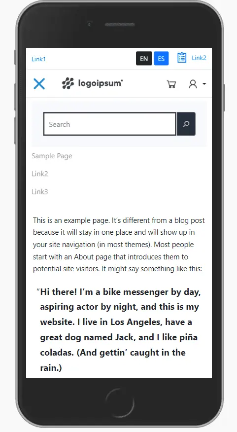
Mobile viewport will use a separate search form. The form will be hidden in collapsed div. After the hamburger menu button is clicked, the menu navigation and form will show up.
<?php
/**
 * // template-parts/header/site-menu.php
 */
?>
<div class="collapse navbar-collapse" id="main-menu">
    <div class="mobile-search-wrapper" id="searchform2">
        <form class="w-100 input-group" method="get" action="<?php echo esc_url( home_url( '/' ) ); ?>">
            <input type="search" class="form-control" required name="s"  placeholder="<?php _e( 'Search'); ?>" aria-label="<?php _e( 'Search'); ?>" value="<?php echo get_search_query(); ?>">
            <button class="btn btn-outline-secondary button-search" type="submit" id="button-addon2"><i class="las la-search"></i></button>
        </form>
    </div>
    <?php
    wp_nav_menu(array(
        'theme_location' => 'primary',
        'container' => false,
        'menu_class' => '',
        'fallback_cb' => '__return_false',
        'items_wrap' => '<ul id="%1$s" class="navbar-nav w-100 justify-content-center %2$s">%3$s</ul>',
        'depth' => 2,
        'walker' => new bootstrap_5_wp_nav_menu_walker()
    ));
    ?>
</div>
The last template part is the Top Nav, which includes 2 links and a language switcher for multisite WP configuration.
<?php
// template-parts/header/top-nav.php
$blog_id = get_current_blog_id();
$lang1_class = 'btn-dark';
$lang2_class = 'btn-primary';
if($blog_id == 2) {
    $lang1_class = 'btn-primary';
    $lang2_class = 'btn-dark';
}
?>
<ul class="nav me-auto">
    <li class="nav-item"><a href="#" target="_blank" class="text-decoration-none fs-7"><?php esc_attr_e( 'Link1','my_textdomain'); ?></a></li>
</ul>
<ul class="nav">
    <li class="nav-item me-lg-5 me-3">
        <a href="/" class="btn btn-sm <?php echo $lang1_class; ?>">EN</a>
        <a href="/es/" class="btn btn-sm <?php echo $lang2_class; ?>">ES</a>
    </li>
    <li class="nav-item"><a href="#" target="_blank" class="text-decoration-none fs-7"><i class="las la-clipboard-list la-2x u-ico-va me-2"></i><?php esc_attr_e( 'Link2','my_textdomain'); ?></a></li>
</ul>
Now most of the elements should already be styled with proper bootstrap default styles. We will add custom CSS to apply some last visual touches. The styles also include mobile adjustments and headroom basic styling.
/**
// main nav menu
// assets/css/style.css
 */
.site-branding1 {
    max-width: 179px;
}
.site-header1 {
    grid-template-columns: 1fr 2fr;
}
@media (max-width: 767.98px) {
    .site-header1 {
        grid-template-columns: 50px 1fr 92px;
        max-width: 100%;
    }
}
.site-header1 .item--menu-cart {
    margin-right: 3rem !important;
}
@media (max-width: 991.98px) {
    .site-header1 .item--menu-cart {
        margin-right: 2rem !important;
    }
}
@media (max-width: 767.98px) {
    .site-header1 .item--menu-cart {
        margin-right: 1rem !important;
    }
}
#searchform1 {
    min-width: 160px;
}
@media (max-width: 767.98px) {
    #searchform1 {
        display: none;
    }
}
@media (min-width: 768px) {
    #searchform2 {
        display: none;
    }
}
.mobile-search-wrapper {
    padding: 1.5rem;
    background: #f7f8fc;
}
@media (min-width: 768px) {
    .m-header-3 {
        text-align: center;
    }
}
/**
burger mobile menu
 */
.navbar-light .navbar-toggler {
    background: #2596be !important;
}
.navbar-light .navbar-toggler .navbar-toggler-icon {
    background-image: url("data:image/svg+xml,%3csvg xmlns='http://www.w3.org/2000/svg' viewBox='0 0 30 30'%3e%3cpath stroke='rgba%28255, 255, 255, 0.55%29' stroke-linecap='round' stroke-miterlimit='10' stroke-width='2' d='M4 7h22M4 15h22M4 23h22'/%3e%3c/svg%3e");
}
.menu-btn-burger--wrapper {
    display: block;
}
@media (min-width: 768px) {
    .menu-btn-burger--wrapper {
        display: none;
    }
}
.menu-btn-burger {
    display: block;
}
.menu-btn-burger span {
    display: block;
    width: 33px;
    height: 4px;
    margin-bottom: 5px;
    position: relative;
    background: #2596be;
    border-radius: 3px;
    z-index: 1;
    transform-origin: 4px 0px;
    transition: transform 0.5s cubic-bezier(0.77, 0.2, 0.05, 1), background 0.5s cubic-bezier(0.77, 0.2, 0.05, 1), opacity 0.55s ease;
}
.collapsed .menu-btn-burger {
    margin-top: 5px;
}
.collapsed .menu-btn-burger span {
    transition: none;
}
.collapsed .menu-btn-burger span:first-child {
    transform-origin: 0% 0%;
}
.collapsed .menu-btn-burger span:nth-last-child(2) {
    transform-origin: 0% 100%;
}
.menu-btn-burger--wrapper:not(.collapsed) .menu-btn-burger span {
    opacity: 1;
    transform: rotate(45deg) translate(-2px, -1px);
    transform-origin: 65% 50% 0;
}
.menu-btn-burger--wrapper:not(.collapsed) .menu-btn-burger span:nth-last-child(3) {
    opacity: 0;
    transform: rotate(0deg) scale(0.2, 0.2);
}
.menu-btn-burger--wrapper:not(.collapsed) .menu-btn-burger span:nth-last-child(2) {
    transform: rotate(-45deg) translate(0, -1px);
}
/**
helpers
 */
.no-styles {
    background: none !important;
    color: inherit;
    border: none;
    padding: 0;
    font: inherit;
    cursor: pointer;
    outline: inherit;
}
.u-ico-va {
    display: inline-block;
    vertical-align: -0.18em;
    height: 1rem;
}
.fs-7 {
    font-size: 0.875rem !important;
}
/**
headroom styles
 */
@media (max-width: 767.98px) {
    .headroom {
        will-change: transform;
        transition: transform 200ms linear;
        position: fixed;
        top: 0;
        left: 0;
        right: 0;
        z-index: 10;
    }
    .headroom--pinned {
        transform: translateY(0%);
    }
    .headroom--unpinned {
        transform: translateY(-100%);
    }
    .headroom.animated {
        -webkit-animation-duration: 0.5s;
        -moz-animation-duration: 0.5s;
        -o-animation-duration: 0.5s;
        animation-duration: 0.5s;
        -webkit-animation-fill-mode: both;
        -moz-animation-fill-mode: both;
        -o-animation-fill-mode: both;
        animation-fill-mode: both;
        will-change: transform, opacity;
    }
    .headroom.animated.slideUp {
        -webkit-animation-name: slideUp;
        -moz-animation-name: slideUp;
        -o-animation-name: slideUp;
        animation-name: slideUp;
    }
    .headroom.animated.slideDown {
        -webkit-animation-name: slideDown;
        -moz-animation-name: slideDown;
        -o-animation-name: slideDown;
        animation-name: slideDown;
    }
}
@keyframes slideDown {
    0% {
        transform: translateY(-100%);
    }
    100% {
        transform: translateY(0);
    }
}
@keyframes slideUp {
    0% {
        transform: translateY(0);
    }
    100% {
        transform: translateY(-100%);
    }
}
/**
headroom body room
 */
@media (max-width: 767.98px) {
    body {
        padding-top: 117px;
    }
    html,
    body {
        scroll-padding-top: 117px;
    }
}
Headroom.js initialization
Headroom, a lightweight js script, is a useful addition for the mobile view. When a user is scrolling down, the mobile menu will hide. After the user starts to scroll up, the menu will show up again. The core script is already enqueued, what is left is initialization.
// assets/js/main.js
if(document.getElementById("js-m-header")) {
    const header = document.querySelector("#js-m-header");
    const ops = {
        "offset": 100,
        "tolerance": 5,
        "classes": {
            "initial": "headroom animated",
            "pinned": "headroom--pinned slideDown",
            "unpinned": "headroom--unpinned slideUp"
        }
    };
    const headroom = new Headroom(header, ops);
    headroom.init();
}
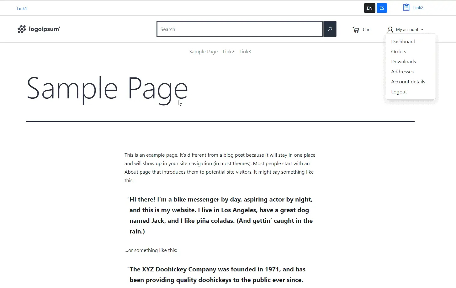
BS5 WordPress Menu preview
The attached screenshot is from WordPress installation with the WooCommerce plugin activated. The theme used here is ‘twentytwentyone’ with our changes applied. We are showing the desktop view. The header is fully functional.
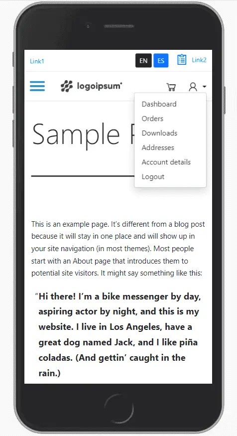
Bootstrap5 WP mobile menu preview
The hamburger menu will animate into close X icon on click.
That’s it for today’s tutorial. Make sure to follow us for other useful tips and guidelines.


![How to Fight AI Hallucinations About Your Brand [ready-to-use prompt inside]](https://www.createit.com/wp-content/uploads/2026/02/How-to-Fight-AI-Hallucinations-355x200.jpg)