GA Conversion Report in Data Studio

Challenge: create an automatic Data Studio conversion report for Google Analytics using 2 GA sources
Solution: use Data Source and Blended Data in the Google Studio Pivot Table
Google Analytics is a nice tool. It provides useful stats about website visitors. You can also set up conversion goals, such as: filling a contact form, clicking the ‘Call me’ button or completing an order. GA is great for creating custom reports: you can define date range and display all the conversions with sources in one table. Only downside? To gather advanced data, you need to do it manually. If you are an Internet marketing specialist working in a digital marketing agency, you will need to learn it.
Preparing a monthly conversion report for marketing team or for your customer? Tired of analyzing Google Analytics data manually, copying and pasting numbers into Excel Spreadsheet? Google Data Studio is the answer. In this article, you will find a fast and easy way to automate conversion reporting. We will use Blend Data to join two data sources (two different GA accounts) and display a summary report.
Served from cache
Google Analytics reports that use Blended Data may be slow to render (joining 2 datasets requires a lot of computation). Slow Data Studio report rendering? The data table keeps freezing? Long wait time for displaying the Pivot table data in Google Data Studio? A popular solution for those issues is serving source data from cache.
Enabling Data Studio cache: the only way to enable cache is to choose “create Data source”. Reports created from Data sources will be cached on the server.
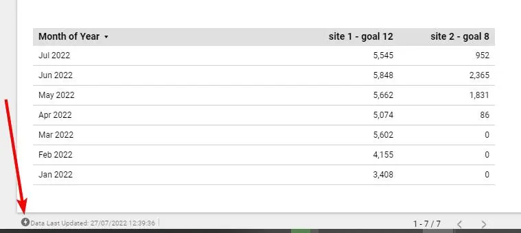
Not sure if data is served from the cache? Look at the bottom left corner of the page. If there is a lightning icon with info: Data Last Updated: 27/07/2022 12:39:36, it means that data is served from cache. You should experience improved performance of data loading.
Analytics data sources
In this practical example, we will fetch data from two sources: 2 different websites with separate GA tracking code embedded. Because analytics include a lot of data, we are going to optimize it by using the Data Studio caching feature: creating “Data Source”. Sources joined using Blended Data are way faster when using “Data Source”.
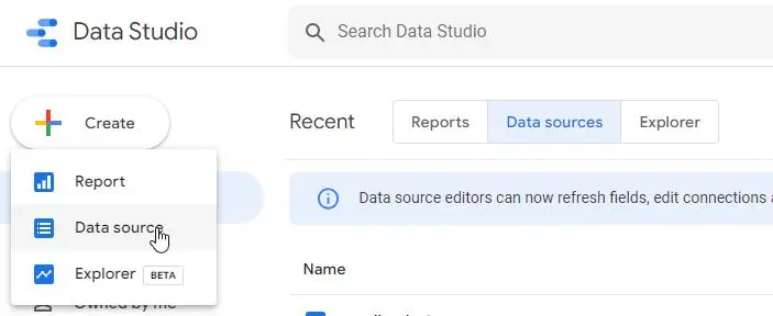
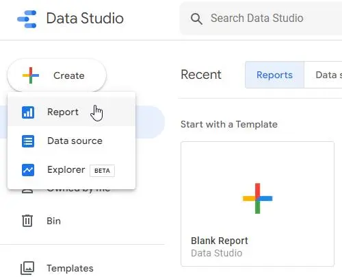
Let’s use the ‘Create’ button placed in the top left corner, and click ‘Data source’.
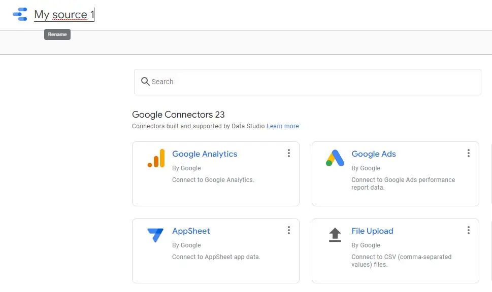
Now we need to rename the source and pick the Google Connector: ‘Google Analytics’. Select your GA account and click ‘Connect’ (top right corner).
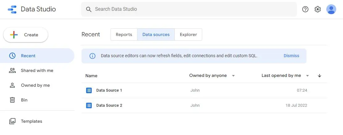
I assume we already have 2 data sources added (two different Google Analytics accounts). If this is the case, in the main dashboard –’Data sources’ tab – you will see your data sets.
Google Data Studio reports
We are going to create 4 reports / tables that include conversion goals. Our goals / leads, previously configured in GA are: “user session longer than 1 minute”. But of course, you can use any conversion goal you are tracking in your GA, for example: completing an order, sending a contact form, downloading a PDF file or adding an email to the newsletter list. We are going to generate:
- Conversions by source (totals) – Table
- Conversions by months – Table
- Conversions by months and sources – Pivot Table
- Conversions by months and sources (totals) – Pivot Table
On top of the page, we will have ‘Date range control’ allowing to control what data is analyzed. The default range is set to current year.
Creating a report
We will start with an empty report, and later we will add 4 pages in total that include 4 tables. The first step is to click Create → Report.
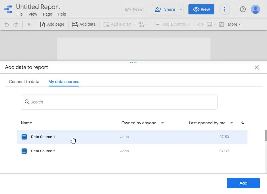
Now select ‘Add data to report’ – My data sources – Data Source 1. Confirm by clicking ‘Add’ (placed in the bottom right corner).
Later, we will connect this with: Data Source 2.
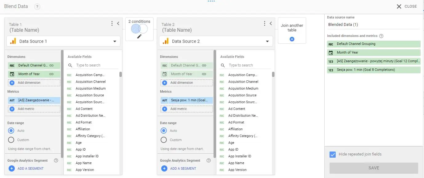
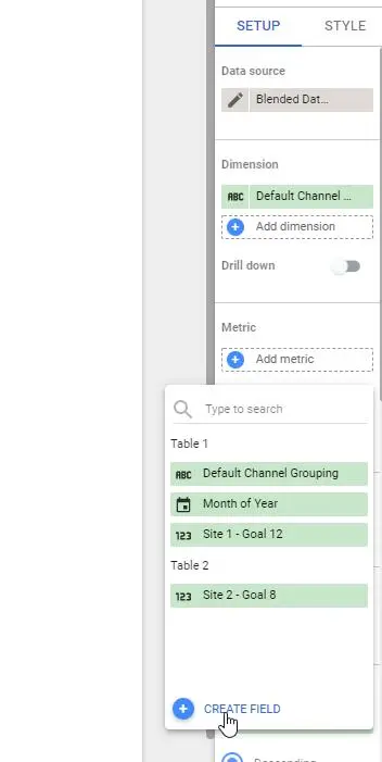
Blended Data configuration
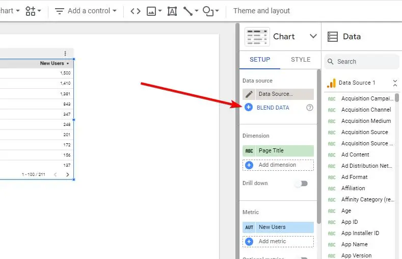
At this point, we have a default table displayed with some data fetched from Data Source 1. The next step is to configure the connection between Data Source 1 and Data Source 2. In the configuration panel, click the ‘Blend Data’ button.
Now, we have the most important step to complete, to configure Blend Data correctly applying the correct joining. If this step is done correctly, the data will be displayed fast and without any errors.
The Blend Data recommended settings are:
Dimensions:
- Default Channel Grouping
- Month of Year
Metrics:
- Goal 12 Completions (Table 1) (user session longer than 1 minute)
and
- Goal 8 Completions (Table 2)
It’s worth to mention that GA provides different metrics for each goal, for example our Goal 8 will have the following fields available:
- Goal 8 Abandoned Funnels
- Goal 8 Abandonment Rate
- Goal 8 Completions
- Goal 8 Conversion Rate
- Goal 8 Starts
- Goal 8 Value
- Site Search Goal 8 Conversion Rate
If you want to measure completed conversions only, choose a field that includes the word “Completions” (this should be your chosen Metrics).
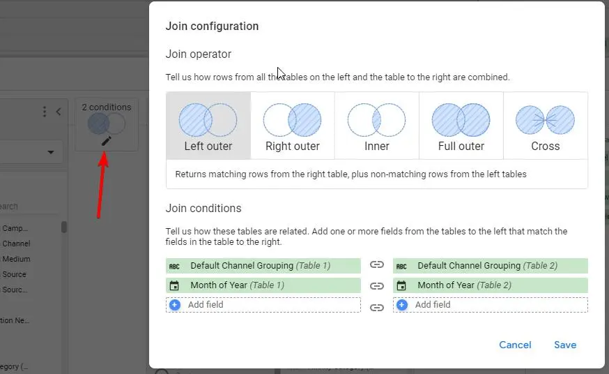
Regarding join settings:
We are going to do “Left outer’ on conditions:
- Default Channel Grouping (Table 1)
- Month of Year (Table 1)
and:
- Default Channel Grouping (Table 2)
- Month of Year (Table 2)
Once completed, we have a proper blended data source. We will use it as a primary source for every table with conversion data displayed. You can also add more metrics, but then data loading can be slower (join using multiple keys is more resource heavy). The recommended consideration is to create different reports for each conversion goal.
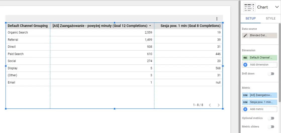
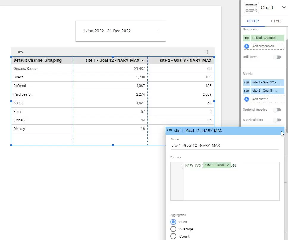
Conversions by source (totals)
Our first table will include 3 columns: Channel (source of traffic), Site 1 Goal, Site 2 Goal. We are comparing total goal completion occurrences fetched from 2 data sources (different GA accounts)
Here is a recipe for this table:
Data source:
- Blended data (just created)
Dimension:
- Default Channel Grouping
Metric: (those used for join)
- Goal 12 Completions
- Goal 8 Completions
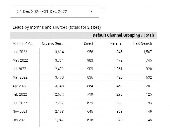
Our Default Channel Grouping (sources) fetches data from GA history and displays:
- Organic Search (link clicked in Google Search Results)
- Referral (link clicked on a different website)
- Direct (url typed directly in the browser, bookmark clicked)
- Paid Search (Google Advertisement: AdWords clicked)
- Social (link clicked on social media: FB, Twitter etc.)
- Display (ads clicked, for example: banner)
- Other (not defined)
- Email (link in e-mail clicked)
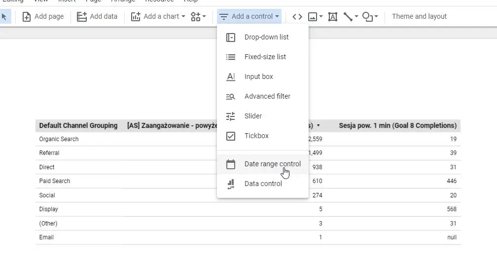
Data Studio table customization
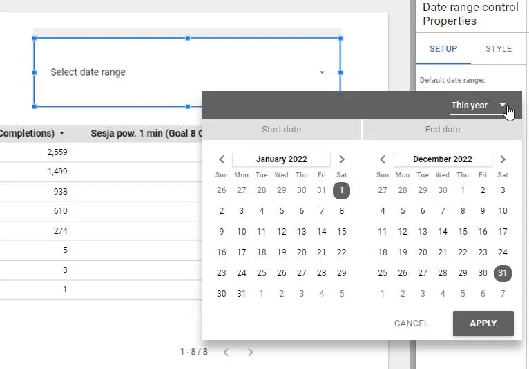
The table displays proper data and works really fast. It would be nice to be able to set the date range of fetched data and change column headers. In the main menu, choose ‘Add a control’ and ‘Date range control’. You will be able to set the “default” range for dates.
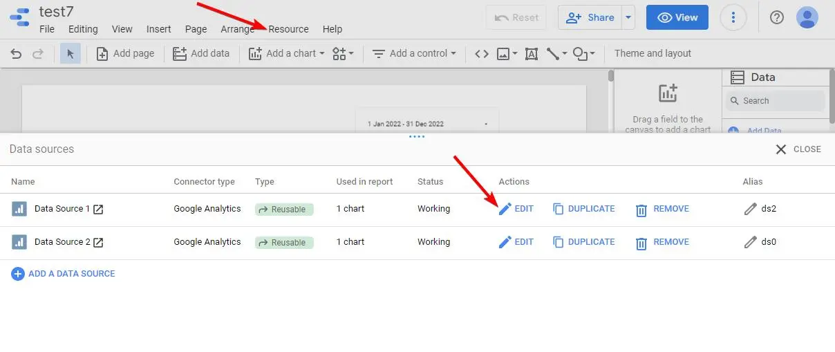
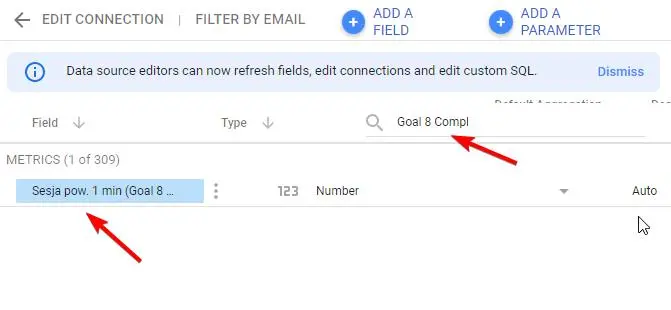
Regarding changing column header labels, go to Text menu: Resource – Manage added data sources. On the list, look for Actions: EDIT . Now, to change column names use “Search fields” input and look for: Goal 8 Compl . Now, you can click on Metric name and change its value.
Here is our table, but with date range select and customized table column names:
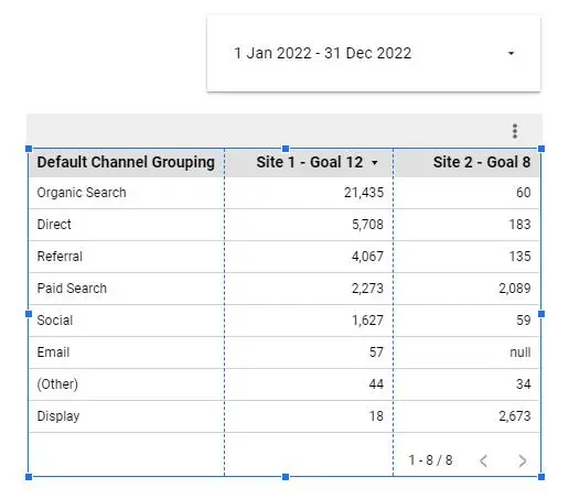
Data studio – null values
Sometimes, the table displays a null value. We see in the table that Site 2 Goal has Email Channel defined as null. This null looks a bit strange. It would be better to display 0 there. In addition, when doing fields aggregation, the SUM function will miscalculate totals when the field is null.
Here is a solution for fixing null in the Google Data Studio Table: use Add metric / CREATE FIELD – NARY_MAX. NARY_MAX will return a predefined value (0) when seeing null.
Let’s fix our table and display 0 instead of null. We need to select a Table and add new metrics in the Setup panel. The field formula should be:
NARY_MAX(Site 1 – Goal 12,0)
( where “Site 1 – Goal 12” is the name of our metric conversion field )
and the same for the second metric:
NARY_MAX(Site 2 – Goal 8,0)
The result is as expected – instead of null, we have 0 value in the table!
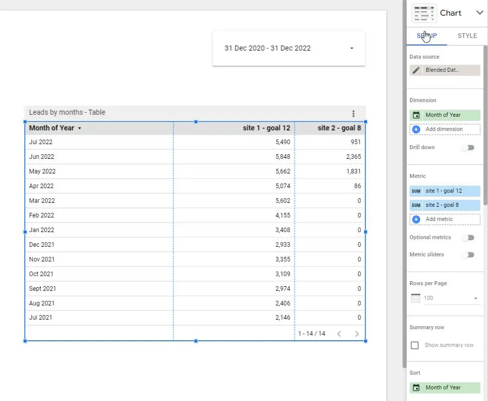
Conversions by month
Displaying conversion goals month by month is a useful report that will show conversion rate and its trajectory. The new chart type will be just: table.
Table recipe:
Data source:
- Blended Data
Dimension:
- Month of Year
Metric:
- custom field: NARY_MAX(Site 1 – Goal 12,0)
- custom field: NARY_MAX(Site 2 – Goal 8,0)
Sort:
- Month of Year
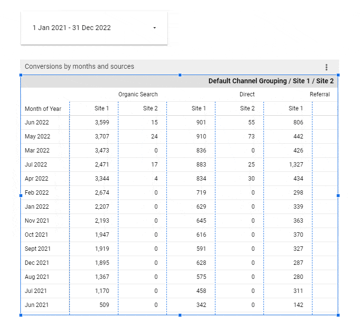
Conversions by months and sources
Ready for something more advanced? We will use a Pivot table to display Conversions by months and sources, displayed separately for each site data source. The table will also show ‘Grand total’ to render the sum of the columns data.
Pivot table recipe:
Data source:
- Blended data (we are still using the same source, defined at the beginning)
Row dimension:
- Month of Year
Column dimension:
- Default Channel Grouping
Metric:
- custom field: NARY_MAX(Site 1 – Goal 12,0)
- custom field: NARY_MAX(Site 2 – Goal 8,0)
Total:
- Rows – Show grand total
Sorting: Month of Year
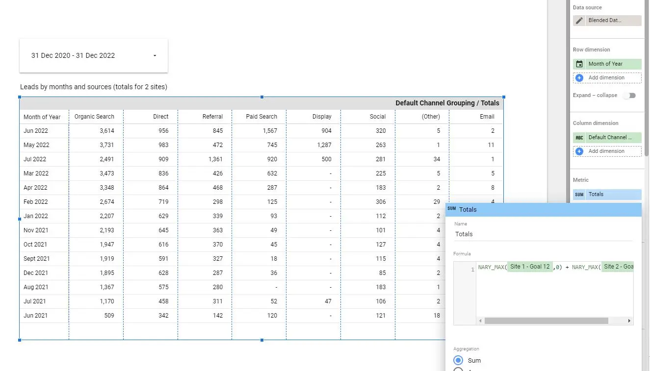
Leads by months and sources (totals)
What about just displaying totals from both sites (sum of conversions)? It is possible, the only difference from previous example is the Metric value. We will add only one metric: CREATE FIELD:
NARY_MAX(Site 1 – Goal 12,0) + NARY_MAX(Site 2 – Goal 8,0)
Download as PDF
Reports created in the Google Data Studio are an easy and automated solution for delivering monthly goal results. You can change the date range controls and present different timelines. A useful option is to save a report as PDF. The generated PDF can be used to deliver data to the Marketing Team or the Customer.
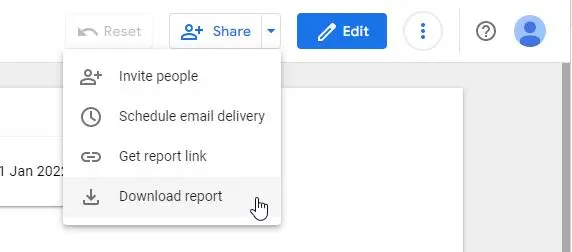
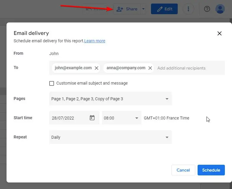
Deliver the report by e-mail
Another interesting option in Data Studio is the ability to schedule email delivery for a particular report. Just click the Share link at the top of the report. “Schedule email delivery” is an option to click. You can send it daily, weekly, monthly or using a custom frequency. You can even customize the email subject and message text. Additional recipients can be added in the ‘To’ field.
Conclusion
In this article, we have shown basic Data Studio usage and simple examples. Now we know how to create blended data and group data by channel (source) and month. With this knowledge, you will be able to create more advanced reports, for example: fetching stats from more than 2 sources or configuring multiple metrics (more than 2 conversion goals).
Follow us for other useful tips and guidelines.


![How to Fight AI Hallucinations About Your Brand [ready-to-use prompt inside]](https://www.createit.com/wp-content/uploads/2026/02/How-to-Fight-AI-Hallucinations-355x200.jpg)