Key combination holding event in React

Challenge: detect that 2 keyboard keys are pressed
Solution: use keydown and keyup event listeners
When creating a React app or a simple website you might want to support some keyboard shortcuts. One example will be to start recording voice from microphone or to mute it. Usually, we would use a key listener that would check if a key was pressed or released.
In this tutorial, we will show a more advanced example: we will detect a situation where two keys are pressed. Another event will listen to the event when the keys are released.
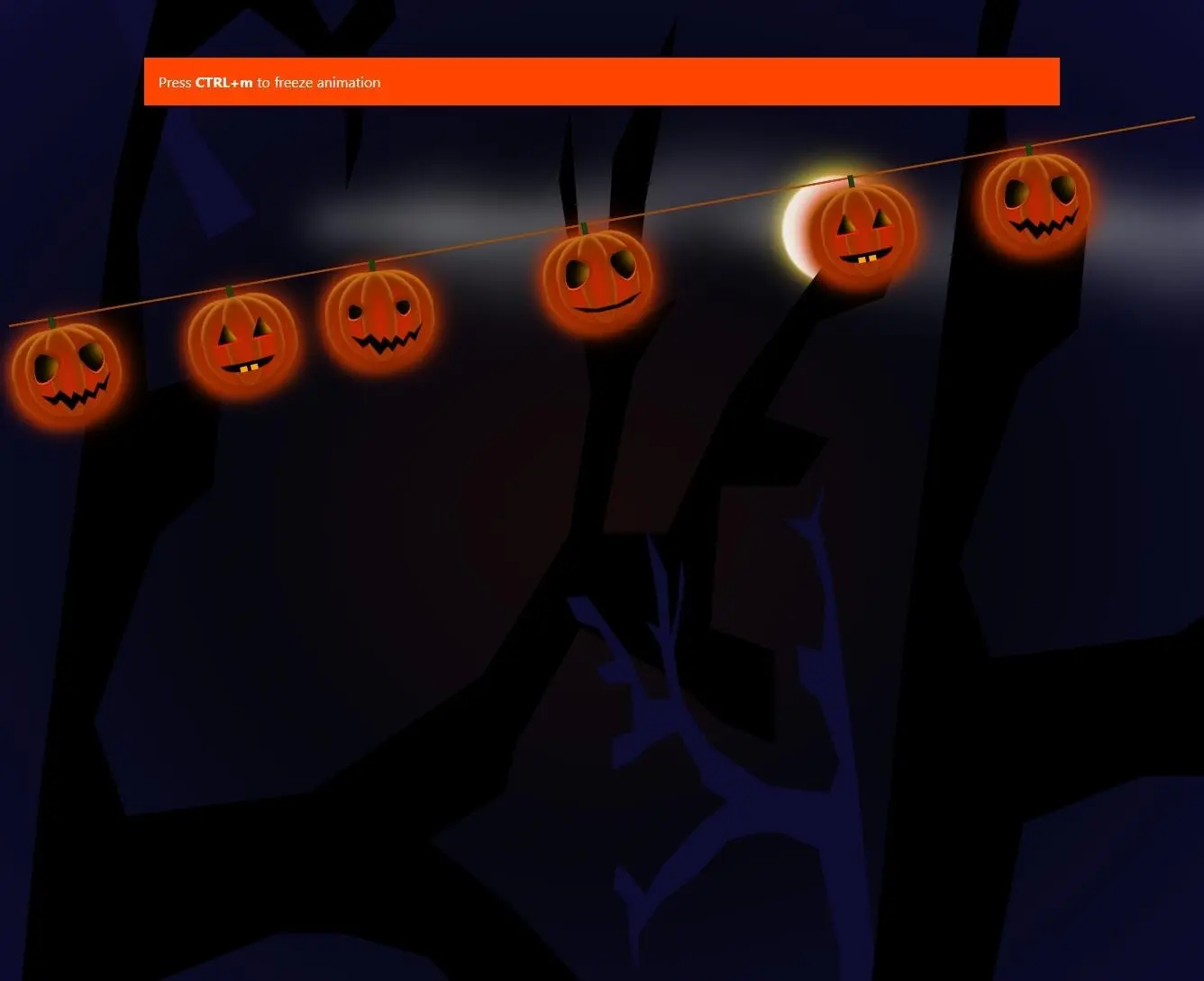
In our demo, we will have animated pumpkins, the perfect content for Halloween. When pressing and holding 2 keyboard keys – CTRL+m – the animation will freeze. We’re just adding a special CSS class to stop the animation.
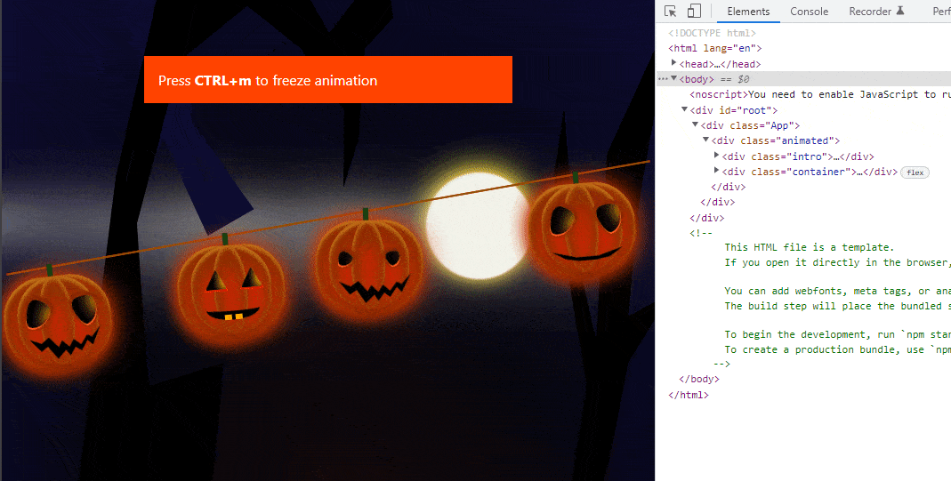
Pumpkins app
The Main React file just imports the Pumpkins component and renders it.
// src/App.js
import './App.css';
import {Pumpkins} from "./Pumpkins";
function App() {
  return (
    <div className="App">
      <Pumpkins />
    </div>
  );
}
export default App;
Holding keys JS event
To detect that a user is holding the keys, we use document.addEventListener, which listens to the keydown event. The keyup event will detect the moment when the keys are released. Here is the most important part of the script, responsible for handling keyboard events:
    useEffect(() => {
        const onKeyDown = (e) => {
            if (e.ctrlKey && e.key === FREEZE_KEY){
                setDivClass('not-animated');
            }
        }
        const onKeyUp = (e) => {
            // on purpose (only one key in condition)
            if (e.key === FREEZE_KEY){
                setDivClass('animated');
            }
        }
        document.addEventListener("keydown", onKeyDown);
        document.addEventListener("keyup", onKeyUp);
        return () => {
            document.removeEventListener("keydown", onKeyDown);
            document.removeEventListener("keyup", onKeyUp);
        }
        // eslint-disable-next-line
    }, [])
useEffect, useState and the keydown event listener
On app initialization, we use the useEffect hook without any parameters. It will be triggered once on startup. When the ctrlKey and ‘m’ key are down and pressed, we are adding the ‘not-animated’ CSS class that will stop the animation.
When the ‘m’ key is released (keyUp event), a new CSS class ‘animated’ is set. This will enable the pumpkins animation again.
src/Pumpkins.js returns the HTML code needed for displaying the page. Animations are CSS only. The article was inspired by the codePen demo: https://codepen.io/mariecharpentier/pen/ExLegBy . I would like to thank the author for the inspiration!
// src/Pumpkins.js
import React, { useEffect, useState } from 'react';
/**
 * Thanks to https://codepen.io/mariecharpentier/pen/ExLegBy for inspiration
 */
export const Pumpkins = (props) => {
    const FREEZE_KEY = 'm';
    const [divClass, setDivClass] = useState('animated');
    useEffect(() => {
        const onKeyDown = (e) => {
            if (e.ctrlKey && e.key === FREEZE_KEY){
                setDivClass('not-animated');
            }
        }
        const onKeyUp = (e) => {
            // on purpose (only one key in condition)
            if (e.key === FREEZE_KEY){
                setDivClass('animated');
            }
        }
        document.addEventListener("keydown", onKeyDown);
        document.addEventListener("keyup", onKeyUp);
        return () => {
            document.removeEventListener("keydown", onKeyDown);
            document.removeEventListener("keyup", onKeyUp);
        }
        // eslint-disable-next-line
    }, [])
    return (
        <div className={divClass}>
            <div className="intro">Press <strong>CTRL+{FREEZE_KEY}</strong> to freeze animation</div>
            <div className="container">
                <div className="moon"></div>
                <div className="clouds cloud1">
                    <div></div>
                    <div></div>
                </div>
                <div className="clouds cloud2">
                    <div></div>
                    <div></div>
                </div>
                <div className="clouds cloud3">
                    <div></div>
                    <div></div>
                </div>
                <div className="clouds cloud4">
                    <div></div>
                    <div></div>
                </div>
                <div className="clouds cloud5">
                    <div></div>
                    <div></div>
                </div>
                <div className="smoke">
                    <div></div>
                </div>
                <div className="tree tree1"></div>
                <div className="tree tree2"></div>
                <div className="tree tree3"></div>
                <div className="tree tree4"></div>
                <div className="tree tree5"></div>
                <div className="dancing-line">
                    <div className="pumpkin">
                        <div className="stem"></div>
                        <div className="heart"></div>
                        <div className="rounded-eyes"></div>
                        <div className="rounded-eyes"></div>
                        <div className="mean-mouth"></div>
                    </div>
                    <div className="pumpkin">
                        <div className="stem"></div>
                        <div className="heart"></div>
                        <div className="eye"></div>
                        <div className="eye eye-right"></div>
                        <div className="bb-mouth"></div>
                    </div>
                    <div className="pumpkin">
                        <div className="stem"></div>
                        <div className="heart"></div>
                        <div className="rounded-eyes baby-eyes"></div>
                        <div className="rounded-eyes baby-eyes"></div>
                        <div className="mean-mouth"></div>
                    </div>
                    <div className="pumpkin">
                        <div className="stem"></div>
                        <div className="heart"></div>
                        <div className="rounded-eyes"></div>
                        <div className="rounded-eyes"></div>
                        <div className="rounded-mouth"></div>
                    </div>
                    <div className="pumpkin">
                        <div className="stem"></div>
                        <div className="heart"></div>
                        <div className="eye"></div>
                        <div className="eye eye-right"></div>
                        <div className="bb-mouth"></div>
                    </div>
                    <div className="pumpkin">
                        <div className="stem"></div>
                        <div className="heart"></div>
                        <div className="rounded-eyes"></div>
                        <div className="rounded-eyes"></div>
                        <div className="mean-mouth"></div>
                    </div>
                    <div className="pumpkin">
                        <div className="stem"></div>
                        <div className="heart"></div>
                        <div className="eye"></div>
                        <div className="eye eye-right"></div>
                        <div className="bb-mouth"></div>
                    </div>
                    <div className="pumpkin">
                        <div className="stem"></div>
                        <div className="heart"></div>
                        <div className="rounded-eyes baby-eyes"></div>
                        <div className="rounded-eyes baby-eyes"></div>
                        <div className="mean-mouth"></div>
                    </div>
                </div>
            </div>
        </div>
    );
}
CSS animations
The animations use CSS properties: transform and animation. To stop the animation, we add the CSS class: not-animated :
.not-animated * {
    animation: none !important;
}
Here is the content of the entire src/App.css file:
/* Global */
body {
    margin: 0;
    font-family: -apple-system, BlinkMacSystemFont, 'Segoe UI', 'Roboto', 'Oxygen',
    'Ubuntu', 'Cantarell', 'Fira Sans', 'Droid Sans', 'Helvetica Neue',
    sans-serif;
    -webkit-font-smoothing: antialiased;
    -moz-osx-font-smoothing: grayscale;
}
body {
  margin: 0;
  height: 100vh;
  background: radial-gradient(
          ellipse at center,
          #160909 0%,
          #05060f 45%,
          #0d0b30 100%
  );
  box-sizing: border-box;
  overflow: hidden;
}
.container {
  width: 100vw;
  height: 100%;
  display: flex;
  align-items: center;
  justify-content: center;
  position: relative;
}
/* Sky */
.moon {
  position: absolute;
  top: -50px;
  left: 65%;
  z-index: -1;
  width: 120px;
  height: 120px;
  border-radius: 50%;
  background: #f2f2ea;
  box-shadow: 0px -6px 36px 0px #fbeb36, 0px 0px 16px 0px #ffb347;
  filter: blur(1px);
}
.clouds {
  position: absolute;
  top: 4%;
  left: -15%;
  width: 380px;
  height: 10px;
  background: #f2f2ea;
  box-shadow: 0px -6px 36px 0px #f2f2ea;
  filter: blur(20px);
  opacity: 0.6;
  animation: fly 25s linear 0s infinite;
}
.cloud2 {
  left: 20%;
  top: 10%;
  width: 80px;
}
.cloud3 {
  left: 40%;
  top: 34%;
  height: 8px;
  box-shadow: 0px -6px 36px 0px #f2f2ea;
}
.cloud4 {
  left: 60%;
  top: 16%;
  width: 80px;
}
.cloud5 {
  left: 80%;
  top: 40%;
  height: 5px;
  width: 120px;
}
.clouds div {
  position: absolute;
  top: -2px;
  left: 100px;
  width: 80px;
  height: 30px;
  background: #f2f2ea;
  box-shadow: 0px -6px 36px 0px #f2f2ea;
  filter: blur(30px);
}
.clouds div:nth-child(2) {
  top: 30px;
  left: 180px;
  width: 120px;
  height: 20px;
}
/* Smoke */
.smoke {
  position: absolute;
  bottom: 0;
  right: 0;
  width: 180px;
  height: 20px;
  box-shadow: 0px -6px 36px 0px #d2c7d0;
  filter: blur(20px);
  opacity: 0.6;
  animation: smoke 25s linear 0s infinite;
  transform: scale(2);
}
.smoke div {
  position: absolute;
  top: -20px;
  left: 100px;
  width: 180px;
  height: 20px;
  background: #d2c7d0;
  box-shadow: 0px -6px 36px 0px #d2c7d0;
  filter: blur(30px);
}
/* Forest Background */
.tree {
  position: absolute;
  bottom: 0;
  left: 0;
  width: 400px;
  height: 80vh;
  background: black;
  transform: scale(2);
  clip-path: polygon(
          0% 97%,
          3% 82%,
          7% 73%,
          12% 49%,
          19% 23%,
          23% 15%,
          21% 10%,
          25% 15%,
          33% 15%,
          25% 18%,
          21% 25%,
          22% 32%,
          29% 31%,
          28% 36%,
          23% 38%,
          17% 46%,
          20% 50%,
          37% 49%,
          53% 44%,
          61% 38%,
          63% 32%,
          60% 23%,
          61% 20%,
          62% 26%,
          64% 30%,
          65% 22%,
          71% 16%,
          70% 19%,
          68% 24%,
          67% 29%,
          71% 28%,
          67% 31%,
          64% 38%,
          70% 38%,
          76% 32%,
          87% 25%,
          93% 25%,
          90% 28%,
          84% 29%,
          79% 33%,
          85% 34%,
          82% 36%,
          75% 36%,
          74% 42%,
          80% 43%,
          80% 47%,
          75% 46%,
          70% 44%,
          62% 42%,
          56% 47%,
          55% 49%,
          48% 51%,
          56% 54%,
          66% 59%,
          71% 63%,
          76% 60%,
          79% 59%,
          80% 62%,
          76% 64%,
          75% 70%,
          73% 73%,
          73% 68%,
          67% 64%,
          56% 60%,
          48% 56%,
          40% 55%,
          34% 55%,
          23% 57%,
          20% 64%,
          17% 70%,
          17% 79%,
          12% 83%,
          15% 97%
  );
}
.tree2 {
  background: #0d0b30;
  transform: rotate(-30deg);
}
.tree3 {
  transform: rotate(-20deg);
  transform: scale(3);
  top: 225px;
  left: 300px;
}
.tree4 {
  left: 600px;
  top: 200px;
  transform: scaleX(-1);
  background: #0d0b30;
}
.tree5 {
  left: 1260px;
  top: 50px;
  transform: scale(3);
}
/* Line */
.dancing-line {
  background: red;
  border-top: 2px solid #8c5407;
  width: 100%;
  position: relative;
  transform: rotateZ(-10deg);
}
.stem {
  position: absolute;
  top: -14px;
  left: 45px;
  width: 6px;
  height: 24px;
  border-radius: 1px;
  background-color: #194d14;
  background-image: linear-gradient(
          to right,
          rgba(0, 0, 0, 0.3) 0%,
          rgba(0, 0, 0, 0.1) 58%,
          rgba(0, 0, 0, 0.1) 62%,
          rgba(0, 0, 0, 0.3) 100%
  );
}
/* Pumkin body */
.pumpkin {
  position: absolute;
  top: 10px;
  left: 0;
  width: 110px;
  height: 100px;
  border-radius: 46px;
  background: #e02604;
  transform: rotateZ(8deg);
  transform-origin: 50% 0;
  box-shadow: inset 0 0px 20px #964203, 0 0 30px 2px #d23805,
  0px 7px 14px #862400, 0px 3px 4px #ffc039 inset, 0px 0px 0px #f59201 inset,
  0px 12px 19px 10px #862400 inset;
}
.pumpkin::before {
  content: "";
  position: absolute;
  width: 90px;
  height: 100px;
  left: -10px;
  border-radius: 50px;
  background: #e02604;
  box-shadow: inset 0 0px 20px #964203, 0 0 20px 2px #d23805,
  0px 7px 14px #862400, 0px 3px 4px #ffc039 inset, 0px 0px 0px #f59201 inset,
  0px 12px 19px 10px #862400 inset;
}
.pumpkin::after {
  content: "";
  position: absolute;
  width: 90px;
  height: 100px;
  left: 5px;
  border-radius: 50px;
  background: #e02604;
  box-shadow: inset 0 0px 20px #964203, 0px 7px 14px #862400,
  0px 3px 4px #ffc039 inset, 0px 0px 0px #f59201 inset,
  0px 12px 19px 10px #862400 inset;
}
.heart {
  position: absolute;
  top: 0;
  left: 30px;
  z-index: 3;
  width: 38px;
  height: 100px;
  border-radius: 50%;
  background: #e02604;
  box-shadow: inset 0 0px 20px #964203, 0px 7px 14px #862400,
  0px 3px 4px #ffc039 inset, 0px 0px 0px #f59201 inset,
  0px 12px 18px 10px #862400 inset;
}
/* Eyes */
.eye {
  position: absolute;
  top: 25px;
  left: 20px;
  height: 22px;
  width: 22px;
  z-index: 1000;
  background-color: orange;
  box-shadow: inset 15px 0 8px black;
  border: 2px solid red;
  clip-path: polygon(0% 98%, 100% 99%, 52.9% 4.9%);
}
.eye-right {
  left: 60px;
}
.rounded-eyes {
  position: absolute;
  z-index: 10;
  top: 105px;
  left: 20px;
}
.rounded-eyes:before,
.rounded-eyes:after {
  content: "";
  position: absolute;
  width: 26px;
  height: 32px;
  background-color: orange;
  box-shadow: inset 1px 0 2px black, inset 20px 0 16px black,
  0px -4px 2px #ff5722 inset, 0px -2px 3px 2px #862400;
  border-bottom: 2px solid #ff5722;
  border-radius: 30% 70% 70% 30% / 30% 30% 70% 70%;
}
.rounded-eyes:before {
  top: -80px;
  left: -5px;
  transform: rotate(20deg);
}
.rounded-eyes:after {
  top: -80px;
  left: 50px;
  transform: rotate(-20deg);
}
.baby-eyes:before,
.baby-eyes:after {
  width: 16px;
  height: 16px;
  top: -70px;
}
/* Mouth */
.mean-mouth {
  position: absolute;
  width: 100%;
  height: 100px;
  left: 0px;
  top: 4px;
  z-index: 10;
  background: black;
  clip-path: polygon(
          14% 64%,
          25% 79%,
          32% 74%,
          41% 89%,
          50% 80%,
          54% 87%,
          60% 78%,
          66% 83%,
          73% 72%,
          78% 78%,
          88% 57%,
          78% 69%,
          73% 66%,
          66% 76%,
          59% 69%,
          54% 77%,
          47% 69%,
          43% 76%,
          34% 64%,
          26% 70%
  );
}
.rounded-mouth {
  position: absolute;
  width: 100px;
  height: 60px;
  left: 4px;
  top: 30px;
  background: black;
  z-index: 10;
  clip-path: polygon(
          10% 75%,
          25% 90%,
          40% 95%,
          60% 95%,
          75% 91%,
          90% 75%,
          62% 88%,
          37% 88%
  );
  filter: drop-shadow(20px 20px 80px orange);
}
.bb-mouth {
  position: absolute;
  width: 60px;
  height: 14px;
  left: 20px;
  top: 60px;
  z-index: 10;
  border-left: 0 solid transparent;
  border-right: 0 solid transparent;
  border-bottom: 10px solid black;
  -moz-border-radius: 50%;
  -webkit-border-radius: 50%;
  border-radius: 50%;
}
.bb-mouth:before {
  content: "";
  display: block;
  height: 6px;
  width: 8px;
  background-color: orange;
  position: absolute;
  left: 20px;
  top: 18px;
}
.bb-mouth:after {
  content: "";
  display: block;
  height: 6px;
  width: 8px;
  background-color: orange;
  position: absolute;
  left: 32px;
  top: 18px;
}
/* Specific to each lantern */
.pumpkin:nth-child(1) {
  animation: swing 0.8s ease-in-out forwards infinite;
}
.pumpkin:nth-child(2) {
  left: 200px;
  animation: swing 1s ease-in-out forwards infinite;
}
.pumpkin:nth-child(3) {
  left: 360px;
  animation: swing 1.6s ease-in-out forwards infinite;
}
.pumpkin:nth-child(4) {
  left: 600px;
  animation: swing 1s ease-in-out forwards infinite;
}
.pumpkin:nth-child(5) {
  left: 900px;
  animation: swing 1.2s ease-in-out forwards infinite;
}
.pumpkin:nth-child(6) {
  left: 1100px;
  animation: swing 1.6s ease-in-out forwards infinite;
}
.pumpkin:nth-child(7) {
  left: 1440px;
  animation: swing 1s ease-in-out forwards infinite;
}
.pumpkin:nth-child(8) {
  left: 1600px;
  animation: swing 1.3s ease-in-out forwards infinite;
}
/* Animations */
@keyframes swing {
  0% {
    transform: rotate(10deg);
  }
  50% {
    transform: rotate(-5deg);
  }
  100% {
    transform: rotate(10deg);
  }
}
@keyframes fly {
  0% {
    transform: translateX(-100vw);
  }
  100% {
    transform: translateX(100vw);
  }
}
@keyframes smoke {
  0% {
    transform: translateX(100vw);
  }
  100% {
    transform: translateX(-100vw);
  }
}
.intro {
    background: orangered;
    color: #fff;
    position: relative;
    z-index: 1;
    margin: 4rem 10rem 8rem 10rem;
    padding: 1rem;
}
.not-animated * {
    animation: none !important;
}
Source code
The React demo app source code for detecting keyboard keys that a user holds is available to download / clone on GitHub. Repository: https://github.com/createit-dev/141-key-combination-keydown-keyup-in-react
Run demo
NodeJS is required to run the application. Just type the following lines in your terminal:
npm install
npm start
The demo will open automatically in the browser using the http://localhost:3000/ url.
Press CTRL+m to freeze the animation!
That’s it for today’s tutorial. Subscribe to our newsletter to receive more useful tips and guidelines.
Do you need someone to implement this solution for you? Check out our specialists for hire in the outsourcing section or custom web application development services page!


![How to Fight AI Hallucinations About Your Brand [ready-to-use prompt inside]](https://www.createit.com/wp-content/uploads/2026/02/How-to-Fight-AI-Hallucinations-355x200.jpg)