3D Curtain Template

Creating the structure
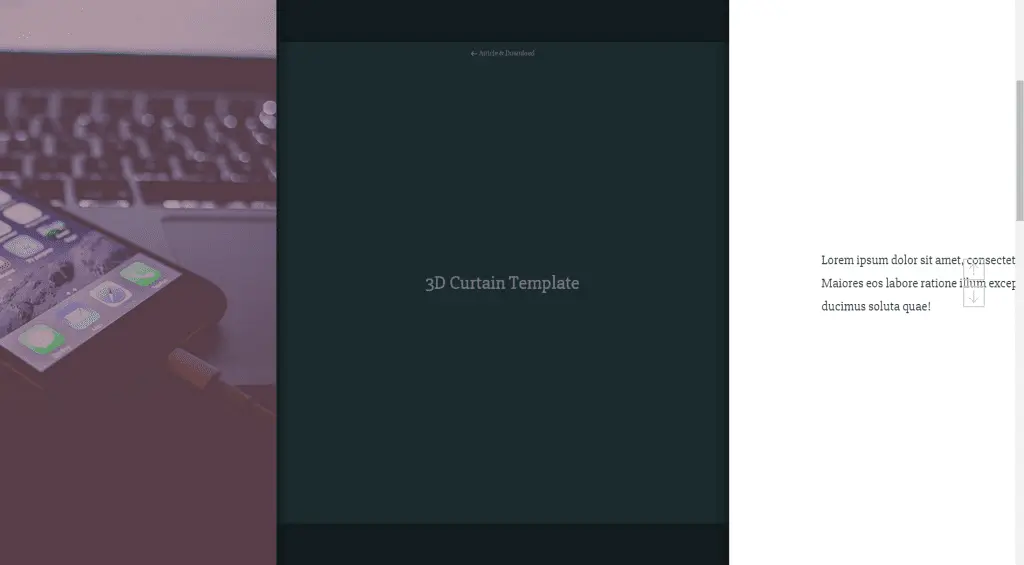
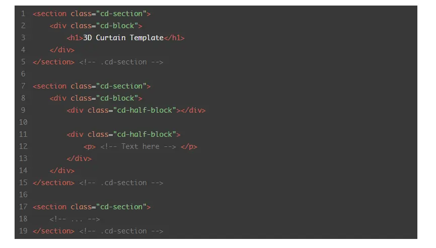
The HTML structure is quite basic: for each block of content we created an element containing a div.cd-block and 2 div.cd-half-block. The first .cd-half-block is always empty and is used to set the background image, while the second contains the text paragraph.
Here’s the structure code:
Adding style
On small devices, we didn’t implement the curtain effect so you’ll see a basic layout with the list of all the sections (you can have a look at the source code for more details).
On desktop devices (viewport width more than 1170px), we assigned the position: fixed and a top: 0 to the .cd-block elements in order to place them on top of the screen (this way they are one on top of the other). Since their containers – .cd-section – have a height: 100vh (and position: static), they still occupy their own space (that way we can scroll the page).
Besides, we assigned a translateX to each .cd-half-block element (translateX(-100%) and translateX(100%) alternatively to :first-of-type and :nth-of-type(2)) so that they are moved outside the viewport.
@media only screen and (min-width: 1170px) {
  .cd-section {
    height: 100vh;
  }
  .cd-block {
    position: fixed;
    top: 0;
    left: 0;
  }
  .cd-half-block {
    height: 100vh;
    width: 50%;
    position: absolute;
    top: 0;
  }
  .cd-section:nth-of-type(even) .cd-half-block:first-of-type,
  .cd-section:nth-of-type(odd) .cd-half-block:nth-of-type(2) {
    left: 0;
    transform: translateX(-100%);
  }
  .cd-section:nth-of-type(odd) .cd-half-block:first-of-type,
  .cd-section:nth-of-type(even) .cd-half-block:nth-of-type(2) {
    right: 0;
    transform: translateX(100%);
  }
}
Events Handling
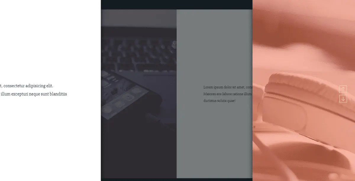
Each section animation is basically made up of two phases: in the first one, the 2 .cd-half-block elements are moved back in the viewport (the translateX value varies from 100%/-100% to 0); in the second one the .cd-block is scaled down and its opacity is reduced (to simulate a 3D movement).
To do so, we attached the triggerAnimation() function to the window scroll event. When the user scrolls, for each .cd-section element we evaluate – using the animateSection() function – the translateX and scale value according to the window scrollTop (and the section offset().top).
$(window).on('scroll', function(){
	triggerAnimation();
});

function triggerAnimation(){
	if(MQ == 'desktop') {
		//if on desktop screen - animate sections
		window.requestAnimationFrame(animateSection);
	} // .....
}

function animateSection () {
	$('.cd-section').each(function(){
		var actualBlock = $(this),
			scale,
			translate,
			opacity;

		//evaluate scale/translate values
		//...

		scaleBlock(actualBlock.find('.cd-block'), scale, opacity);
		translateBlock(actualBlock.find('.cd-half-block').eq(0), '-'+translate);
		translateBlock(actualBlock.find('.cd-half-block').eq(1), translate);
	});
}

function translateBlock(elem, value) {
	elem.css({
	 	//...
		'transform': 'translateX(' + value + ')',
	});
}

function scaleBlock(elem, value, opac) {
	elem.css({
	    //...
		'transform': 'scale(' + value + ')',
		'opacity': opac
	});
}
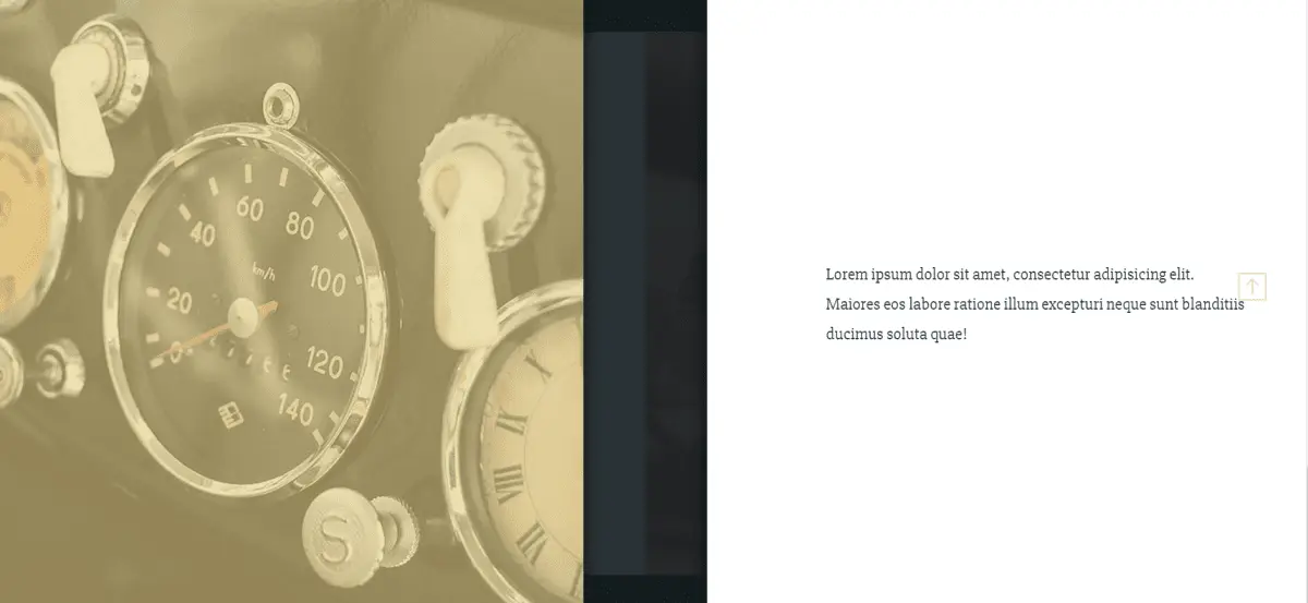
Here is the link to see the demo:
http://codyhouse.co/demo/3d-curtain-template
Here is the link to download files:


![How to Fight AI Hallucinations About Your Brand [ready-to-use prompt inside]](https://www.createit.com/wp-content/uploads/2026/02/How-to-Fight-AI-Hallucinations-355x200.jpg)


