App Loader in React

The React application is loading, time is passing, the user is waiting – but losing his patience. Perhaps it would be a good idea to add a Loader with some text, an animated icon and even show the time that has passed since launching the React app? In this tutorial, we will show a sample implementation.
Our goal here is to have a universal loader that has a minimalistic design, is fast to show, has the ability to change spinner icon color, and is multipurpose.

Loader options
One mode is called the main loader (global). The main application loader will cover the entire screen and show loading text. The application is loading in the background, and when ready, we can trigger the option to remove our component.
{ ! appIsLoaded && <MyLoader loadingText={'Loading..'} cssClass={'mainLoader'} showTimer={true}

strokeColor={'red'}> }
Another option is to use it as a single inline loader for the component or displaying application alerts, such as: Anna is typing.. or Waiting for a response.. . Example usage for inline loader:
<MyLoader loadingText={'Waiting for response..'}>
Count up timer
Our loader has the ability to display a count up timer, showing how many seconds have passed since the app’s launch. It’s a nice feature that allows us to measure app performance time. It’s worth to mention that because of the counter, the MyLoader component is re-rendered every second. So, even a hidden loader will trigger the Reconciliation Algorithm and modify DOM. To maintain good performance, it’s important to remove the Component when it’s not needed anymore. In our demo, we remove the component using the appIsLoaded State.
Loader in React
The loader can be used for single elements on the page, and also as main (global) loader that will cover the entire screen. We have 5 parameters: loadingText (text that appears during loading), cssClass (additional className added to div, used to initialize the global loader), countTo (how long a counter should be counting), showTimer (hide or show the count up timer) and strokeColor to change loader spinner color.
Here is MyLoader React component source code:
// src/MyLoader.jsx
import React, {useEffect} from 'react';
export const MyLoader = (props) => {
    const {loadingText, cssClass = '', countTo = 60, showTimer = false, strokeColor} = props;
    const [counter, setCounter] = React.useState(0);
    const pad = ( value ) => { const prefix = "00:";
    const formatted = value > 9 ? value : "0" + value;
        return prefix + formatted;
    }
    useEffect(() => {
        const timer =
            showTimer && counter < countTo && setInterval(() => setCounter(counter + 1), 1000);
        return () => clearInterval(timer);
    }, [counter, showTimer, countTo]);
    return (
        <div className={`myLoader ${cssClass}`}><span className="myLoader__inner"><span className="myLoader__text">{loadingText}</span><span className={'smallSpinner'}>
                                                                                                                                                                      <svg className="spinner" viewBox="0 0 50 50"> <circle className="path" cx="25" cy="25" r="20" fill="none" strokeWidth="5" style={{stroke: strokeColor}}></circle>
        </svg>
    </span></span>
    { counter > 1 && <span className={'myLoader__counter'}><br/>{pad(counter)}</span> }
    </div>
  );
 }
And CSS styles for both: the global loader and the inline loader:
.App {
text-align: center;
}
.smallSpinner {
  animation: rotate 2s linear infinite;
  display:inline-block; width: 16px;
  min-width: 16px; height:
  16px; min-height: 16px; position: relative;
  top: 3px; margin-right: 4px;
}
.smallSpinner .path {
   stroke: #ccc;
   stroke-linecap: round;
   animation: dash 1.5s ease-in-out infinite;
}
@keyframes rotate {
  100% {
    transform: rotate(360deg);
  }
}
@keyframes dash {
  0% {
    stroke-dasharray: 1, 150;
    stroke-dashoffset: 0;
  }
  50% {
    stroke-dasharray: 90, 150;
    stroke-dashoffset: -35;
  }
  100% {
    stroke-dasharray: 90, 150;
    stroke-dashoffset: -124;
  }
}
.myLoader__inner {
  display:inline-block;
  padding:5px 10px;
  border-radius:8px;
  background-color:rgba(255,255,255,.8);
}
.myLoader__text {
  display:inline-block;
  margin-right:5px;
}
.myLoader__text .smallSpinner {
  margin-left:5px;
}
/*
global loader
*/
.mainLoader {
  position:absolute; left:0;
  right:0; display:block !important; top:50%;
  bottom:auto; z-index:1; margin-top:-20px;
}
.mainLoader:before {
  content:""; position: fixed;
  background:#fff; z-index:1;
  top:1px; bottom:1px; left:1px; right:1px;
}
.mainLoader .myLoader__inner,
.mainLoader .myLoader__counter {
  position:relative;
  z-index:2; }
.hideLoader {
  cursor:pointer;
  position:fixed;
  top:20px;
  right:20px;
  font-size:1rem;
  color:#ccc;
  z-index:2;
  background:transparent;
  border:0;
}
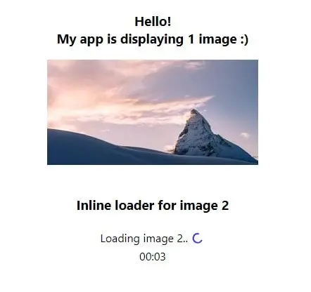
For the demo, we use setTimeout to simulate the loading delay time. Initially for the entire application and then for the single component. Our demo App displays 2 images.
// src/App.jsx
import React, {useState, useEffect} from 'react';
import './App.css';
import {MyLoader} from "./MyLoader";
function App() {
    const [appIsLoaded, setAppIsLoaded] = useState(false);
    const [component1IsLoaded, setComponent1IsLoaded] = useState(false);
    const random = (min, max) => Math.floor(Math.random() * (max - min)) + min;
    useEffect(() => {
        // for demo purpose
        // simulating app loading time
        setTimeout(function () {
            setAppIsLoaded(true);
        }, random(4000, 6000));
    });
    useEffect(() => {
        // for demo purpose
        // simulating component1 loading time
        if(appIsLoaded){
            setTimeout(function () {
               setComponent1IsLoaded(true);
            }, random(5000, 8000));
        }
    }, [appIsLoaded]);
    return (
        <div className="App">
            {!appIsLoaded && <MyLoader loadingText={'Loading..'} cssClass={'mainLoader'} showTimer={true} strokeColor={'red'}/>}
            <h3>Hello!<br/>My app is displaying 1 image :)</h3>
            <img src={'https://picsum.photos/seed/picsum/300/150'} alt={''}/>
            <br/><br/>
            <h3>Inline loader for image 2</h3>
            {appIsLoaded && ! component1IsLoaded &&  <MyLoader loadingText={'Loading image 2..'} showTimer={true} strokeColor={'blue'} /> }
            {appIsLoaded && component1IsLoaded && <img src={'https://picsum.photos/id/1023/300/150'} alt={''}/>}
        </div>
    );
}
export default App;
Image loader
Our demo is not really a real-life example. What about removing the loader when images are 100% loaded? It would be really useful to have this feature working. Let’s make some modification and provide proof that this can be done.
Here is the demo for loading an image (2MB). The loader will hide automatically after the full image is loaded in the browser.
// src/App.jsx
// Demo - for loading image
import React, {useState} from 'react';
import './App.css';
import {MyLoader} from "./MyLoader";
function App() {
    const [component2IsLoaded, setComponent2IsLoaded] = useState(false);
    const [imgOpacity, setImageOpacity] = useState(0);
    const removeLoader = (e) => {
        setComponent2IsLoaded(true);
        setImageOpacity(100);
    }
    return (
        <div className="App">
            <h3>Real image loading (2MB)</h3>
            {(!component2IsLoaded) ? <MyLoader loadingText={'Loading image 2..'} showTimer={true} strokeColor={'#6A5ACD'}  /> : <p>loaded!</p>}
            <img src={'https://eoimages.gsfc.nasa.gov/images/imagerecords/73000/73992/world.200403.3x5400x2700.jpg'} className={'imgLoading'} style={{opacity:imgOpacity}} onLoad={removeLoader} alt={''} />
        </div>
    );
}
export default App;
And styles for adding a fade effect to the just loaded image:
img {
  max-width:500px;
  height:auto;
}
.imgLoading {
  opacity: 0;
  -webkit-transition: all 2s ease;
  -moz-transition: all 2s ease;
  -ms-transition: all 2s ease;
  -o-transition: all 2s ease;
}

Loader color
We can use prop strokeColor to adjust spinner color that is displayed in our loader. To change all loaders globally, simple CSS can be used:
/**
change loader color globally
 */
.myLoader .spinner .path {
  stroke:#000 !important;
}
Loader used with global state
The loader used for single component initialization is easily maintained, but what about having a global state management system that would have the ability to enable or disable global loader on different actions? Let’s use Zustand, the state-management plugin based on hooks. It’s easy to use and doesn’t wrap app in context providers.
In addition, we’re going to show the ‘Close Loader’ icon. If for some reason loading takes longer than expected, the user will be able to click the Close button and see what is below the loading cover. This can also be helpful in the testing phase of the application. Maybe javascript code crashed and we need to remove the loader to see the error message.
Let’s add a dependency: npm install zustand
And define global states:
// src/state.js
import create from "zustand";
const useStateStore = create((set) => ({
        showMainLoader: true,
        setShowMainLoader: (val) => set((state) => ({ showMainLoader: val })),
    })
);
export { useStateStore };
Our loader now has the ability to “close itself” from the inside component. It triggers the zustand global method. We show the “Close loader” button, so the user can close it without waiting.
// src/MyLoader.jsx
// close button added
// global zustand state is used
import React, {useEffect} from 'react';
import { useStateStore } from "./state";
export const MyLoader = (props) => {
    const {loadingText, cssClass = '', countTo = 60, showTimer = false, strokeColor} = props;
    const [counter, setCounter] = React.useState(0);
    const stateStoreLoader = useStateStore((state) => state.setShowMainLoader);
    const pad = ( value ) => {
        const prefix = "00:";
        const formatted = value > 9 ? value : "0" + value;
        return prefix + formatted;
    }
    useEffect(() => {
        const timer =
            showTimer && counter < countTo && setInterval(() => setCounter(counter + 1), 1000);
        return () => clearInterval(timer);
    }, [counter, showTimer, countTo]);
    const hideLoader = () => {
        stateStoreLoader(false);
    }

    return (
        <div className={`myLoader ${cssClass}`}><span className="myLoader__inner"><span className="myLoader__text">{loadingText}</span><span className={'smallSpinner'}>
               <svg className="spinner" viewBox="0 0 50 50">
                  <circle className="path" cx="25" cy="25" r="20" fill="none" strokeWidth="5" style={{stroke: strokeColor}}></circle>
               </svg>
            </span></span>
            { counter > 1 && <span className={'myLoader__counter'}><br/>{pad(counter)}</span> }
            { counter > 1 && <button onClick={hideLoader} className={'hideLoader'}>✖ (Close Loader)</button> }
        </div>
    );
}
App demo loads 2 images and uses special logic for removing the loader. After 2 images are loaded, we are triggering the setShowMainLoader method passing false as a parameter.
// src/App.jsx
// Demo - for loading image + global state management for Loader
import React, {useState, useEffect} from 'react';
import './App.css';
import {MyLoader} from "./MyLoader";
import { useStateStore } from "./state";
function App() {
    const stateStore = useStateStore();
    const [imagesLoaded, setImagesLoaded] = useState(0);
    const countImage = () => {
        // special logic for hiding loader
        setImagesLoaded(imagesLoaded + 1);
    }
    useEffect(() => {
        console.log(imagesLoaded);
        if(imagesLoaded === 2) {
            stateStore.setShowMainLoader(false);
        }
    }, [imagesLoaded]);
    return (
        <div className="App">
            <h3>Using global state</h3>
            {(stateStore.showMainLoader) ? <MyLoader loadingText={'Loading image 3..'} showTimer={true} strokeColor={'#6A5ACD'}  /> : ''}
            <img src={'https://www.desktopbackground.org/download/3840x2160/2010/07/09/45578_swiss-alps-wallpapers-and-images-wallpapers-pictures-photos_3840x2400_h.jpg'} className={stateStore.showMainLoader ? 'imgLoading': 'imgLoaded'} onLoad={countImage} alt={''} />
            {(stateStore.showMainLoader) ? <MyLoader loadingText={'Loading image 4..'} showTimer={true} strokeColor={'red'}  /> : ''}
            <img src={'https://wallpaperaccess.com/full/626343.jpg'} className={stateStore.showMainLoader ? 'imgLoading': 'imgLoaded'} onLoad={countImage} alt={''} />
        </div>
    );
}
export default App;
To show the image after it’s loaded, we need the last part – CSS styles:
.imgLoading {
  opacity: 0;
  -webkit-transition: all 2s ease;
  -moz-transition: all 2s ease;
  -ms-transition: all 2s ease;
  -o-transition: all 2s ease;
  height:0;
}
.imgLoaded {
  opacity:1;
  height:auto;

Using loader for messages
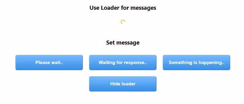
The last loader usage can be displaying messages / alerts. Different things are probably happening in your application, and maybe you would like to inform the user about them. We will use global state. If the message is set, the loader should display the message text at the top of the screen. We have all the functionality in place, we don’t need to change the code of the loader, just adjust the main application function.
// src/App.jsx
// Demo - use loader for displaying messages
import React from 'react';
import './App.css';
import {MyLoader} from "./MyLoader";
import { useStateStore } from "./state";
function App() {
    const stateStore = useStateStore();
    const setMessage = (msg) => {
        stateStore.setShowMainLoader(msg);
    }
    return (
        <div className="App">
            <h3>Use Loader for messages</h3>
            <div className={'appMessage'}>
              {(stateStore.showMainLoader) ? <MyLoader loadingText={stateStore.showMainLoader} showTimer={false} strokeColor={'orange'}  /> : ''}
            </div>
            <br/>
            <h3>Set message</h3>
            <button className={'buttonClass'} onClick={() => {setMessage('Please wait..')}}>Please wait..</button>
            <button className={'buttonClass'} onClick={() => {setMessage('Waiting for response..')}}>Waiting for response..</button>
            <button className={'buttonClass'} onClick={() => {setMessage('Something is happening..')}}>Something is happening..</button>
            <button className={'buttonClass'} onClick={() => {setMessage(false)}}>Hide loader</button>
        </div>
    );
}
export default App;
Lastly, the styles for buttons used in the Demo:
.buttonClass {
  margin:10px;
  font-size:15px;
  width:220px;
  height:50px;
  border-width:1px;
  color:#fff;
  border-color:#84bbf3;
  font-weight:bold;
  border-radius: 6px;
  background:linear-gradient(#79bbff, #378de5);
}
.buttonClass:hover {
  background: linear-gradient(#378de5, #79bbff);
}
That’s it for today’s guidelines in custom web app development. Make sure to follow us for other useful tips and don’t forget to subscribe to our newsletter.


![How to Fight AI Hallucinations About Your Brand [ready-to-use prompt inside]](https://www.createit.com/wp-content/uploads/2026/02/How-to-Fight-AI-Hallucinations-355x200.jpg)