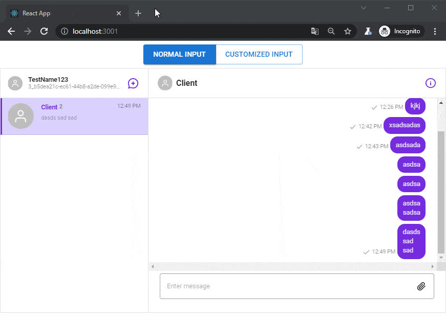
Chat – send message on enter
We have a chat application that uses the SendBird API. Message input is customized, with custom HTML and styles from Material UI. The user can send a message or attach a file. File size is restricted to 1mb.
Adding keyboard events
This article was inspired by an example provided by the SendBird team: https://codesandbox.io/s/2-5-customizing-chatinput-wgi9d?file=/src/CustomizedMessageInput.js . Our improvements include: handling keyboard keys: ENTER will send a message immediately, ENTER + SHIFT will create a new line. Also, dependencies were upgraded to the new MUI Material version 5 and React 17.0.2.
About Sendbird
Founded in 2013, Sendbird developed a messaging-as-a-service API that provides chat, voice, and video messaging for mobile apps and websites. The company is headquartered in San Mateo, CA with additional offices in New York, London, Seoul, Singapore and Bengaluru. It has raised over $220M.
The company was a member of the Winter 2016 Y Combinator class. During the acceleration program, its revenue grew 20 times, leading to funding from many investors, including: ICONIQ Capital, STEADFAST Capital Ventures, Tiger Global Management, Shasta Ventures, Softbank Vision Fund 2, and Y Combinator.
30 days Trial plan
To start using SendBird you can register for a fully operational trial plan and use it without any payment for 30 days. After this time, if you decide for a longer relationship, there are premium plans. The pricing depends on MAU (Monthly Active Chat Users) and starts from $499/month.
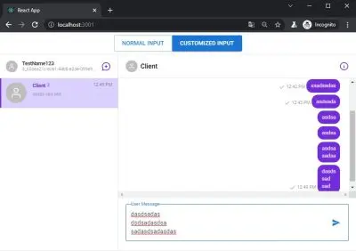
Customized input
Here is the full source code for customizing message input in the SendBird chat. You can use it to create a fully working chat with channels, reactions and file sending. Make sure to change APP_ID and USER_ID variables in const.js!
// App.js
import React, { useState } from "react";
import { SendBirdProvider as SBProvider } from "sendbird-uikit";
import "sendbird-uikit/dist/index.css";
import { ButtonGroup, Button } from "@mui/material";
import { APP_ID, USER_ID, NICKNAME } from "./const";
import CustomizedApp from "./CustomizedApp";
import "./index.css";
import useStyles from "./styles";
export default function App() {
  const classes = useStyles();
  const { selected, unselected, rightButton } = classes;
  const [isCustomizedInput, setIsCustomizedInput] = useState(false);
  return (
      <div className="app-wrapper">
        <div className="channel-selector">
          <div className="channel-selector__icons">
            <ButtonGroup>
              <Button
                  className={isCustomizedInput ? unselected : selected}
                  onClick={() => setIsCustomizedInput(false)}
                  variant={isCustomizedInput ? "outlined" : "contained"}
                  size="large"
              >
                Normal Input
              </Button>
              <Button
                  className={`${
                      isCustomizedInput ? selected : unselected
                  } ${rightButton}`}
                  onClick={() => setIsCustomizedInput(true)}
                  variant={isCustomizedInput ? "contained" : "outlined"}
                  size="large"
              >
                Customized Input
              </Button>
            </ButtonGroup>
          </div>
        </div>
        <SBProvider appId={APP_ID} userId={USER_ID} nickname={NICKNAME}>
          <CustomizedApp isCustomizedInput={isCustomizedInput} />
        </SBProvider>
      </div>
  );
}
Main app settings:
// const.js
// put your own APP_ID here
// get your app_id -> https://dashboard.sendbird.com/auth/signin
export const APP_ID = "AAA";
// set your own USER_ID and NICKNAME
export const USER_ID = "BBB";
export const NICKNAME = "TestName123";
Main function for rendering the entire chat:
// CustomizedApp.jsx
import React, { useState } from "react";
import {
    Channel as SBConversation,
    ChannelList as SBChannelList,
    ChannelSettings as SBChannelSettings,
    withSendBird
} from "sendbird-uikit";
import CustomizedMessageInput from "./CustomizedMessageInput";
function CustomizedApp(props) {
    // props
    const { isCustomizedInput } = props;
    // useState
    const [currentChannelUrl, setCurrentChannelUrl] = useState("");
    const [showSettings, setShowSettings] = useState(false);
    return (
        <div className="customized-app">
            <div className="sendbird-app__wrap">
                <div className="sendbird-app__channellist-wrap">
                    <SBChannelList
                        onChannelSelect={(channel) => {
                            if (channel && channel.url) {
                                setCurrentChannelUrl(channel.url);
                            }
                        }}
                    />
                </div>
                <div className="sendbird-app__conversation-wrap">
                    <SBConversation
                        onChatHeaderActionClick={() => {
                            if (showSettings) {
                                setShowSettings(false);
                            } else {
                                setShowSettings(true);
                            }
                        }}
                        channelUrl={currentChannelUrl}
                        renderMessageInput={
                            isCustomizedInput
                                ? ({ channel, user, disabled }) => (
                                    <CustomizedMessageInput
                                        channel={channel}
                                        user={user}
                                        disabled={disabled}
                                    />
                                )
                                : null
                        }
                    />
                </div>
            </div>
            {showSettings && (
                <div className="sendbird-app__settingspanel-wrap">
                    <SBChannelSettings
                        channelUrl={currentChannelUrl}
                        onCloseClick={() => {
                            setShowSettings(false);
                        }}
                    />
                </div>
            )}
        </div>
    );
}
export default withSendBird(CustomizedApp);
And customized send message input that is styled using MUI Material 5:
// CustomizedMessageInput.jsx
import React, { useState } from "react";
import { sendBirdSelectors, withSendBird } from "sendbird-uikit";
import {
    InputAdornment,
    IconButton,
    FormControl,
    InputLabel,
    OutlinedInput
} from '@mui/material';
import {
    AttachFile as AttachFileIcon,
    Send as SendIcon
} from "@mui/icons-material";
import { makeStyles } from '@mui/styles';
const useStyles = makeStyles({
    input: {
        display: "none"
    }
});
function CustomizedMessageInput(props) {
    const classes = useStyles();
    // props
    const {
        channel,
        disabled,
        // from mapStoreToProps
        sendUserMessage,
        sendFileMessage,
        sdk
    } = props;
    // state
    const [inputText, setInputText] = useState("");
    const [isShiftPressed, setIsShiftPressed] = useState(false);
    const isInputEmpty = inputText.length < 1;
    const KeyCode = {
        SHIFT: 16,
        ENTER: 13,
    };
    // event handler
    const handleChange = event => {
        setInputText(event.target.value);
    };
    const sendFileMessage_ = event => {
        if (event.target.files && event.target.files[0]) {
            console.log(event.target.files[0]);
            // Implement your custom validation here
            if (event.target.files[0].size > 1 * 1000 * 1000) {
                alert("Image size greater than 1 MB");
                return;
            }
            const params = new sdk.FileMessageParams();
            params.file = event.target.files[0];
            sendFileMessage(channel.url, params)
                .then(message => {
                    console.log(message);
                    event.target.value = "";
                })
                .catch(error => {
                    console.log(error.stack);
                });
        }
    };
    const sendUserMessage_ = event => {
        const params = new sdk.UserMessageParams();
        params.message = inputText;
        sendUserMessage(channel.url, params)
            .then(message => {
                console.log(message);
                setInputText("");
            })
            .catch(error => {
                console.log(error.message);
            });
    };
    return (
        <div className="customized-message-input">
            <FormControl variant="outlined" disabled={disabled} fullWidth>
                <InputLabel htmlFor="customized-message-input">User Message</InputLabel>
                <OutlinedInput
                    id="customized-message-input"
                    type="txt"
                    value={inputText}
                    onChange={handleChange}
                    onKeyDown={(e) => {
                        if (e.keyCode === KeyCode.SHIFT) {
                            setIsShiftPressed(true);
                        }
                        if (!isShiftPressed && e.keyCode === KeyCode.ENTER) {
                            e.preventDefault();
                            sendUserMessage_();
                        }
                    }}
                    onKeyUp={(e) => {
                        if (e.keyCode === KeyCode.SHIFT) {
                            setIsShiftPressed(false);
                        }
                    }}
                    multiline
                    endAdornment={
                        <InputAdornment position="end">
                            {isInputEmpty ? (
                                <div className="customized-message-input__file-container">
                                    <input
                                        accept="image/*"
                                        id="icon-button-file"
                                        type="file"
                                        className={classes.input}
                                        onChange={sendFileMessage_}
                                    />
                                    <label htmlFor="icon-button-file">
                                        <IconButton
                                            color="primary"
                                            aria-label="upload picture"
                                            component="span"
                                            disabled={disabled}
                                        >
                                            <AttachFileIcon
                                                color={disabled ? "disabled" : "primary"}
                                            />
                                        </IconButton>
                                    </label>
                                </div>
                            ) : (
                                <IconButton
                                    disabled={disabled}
                                    onClick={sendUserMessage_}
                                    // onMouseDown={sendUserMessage}
                                >
                                    <SendIcon color={disabled ? "disabled" : "primary"} />
                                </IconButton>
                            )}
                        </InputAdornment>
                    }
                />
            </FormControl>
        </div>
    );
}
const mapStoreToProps = store => {
    const sendUserMessage = sendBirdSelectors.getSendUserMessage(store);
    const sdk = sendBirdSelectors.getSdk(store);
    const sendFileMessage = sendBirdSelectors.getSendFileMessage(store);
    return {
        sendUserMessage,
        sdk,
        sendFileMessage
    };
};
export default withSendBird(CustomizedMessageInput, mapStoreToProps);
Let’s add some basic styles:
/**
index.css
 */
.app-wrapper {
  height: calc(100vh - 20px);
}
.channel-selector {
  height: 10%;
  display: flex;
  justify-content: center;
  align-items: center;
}
.channel-selector__icons {
  display: flex;
}
.customized-app {
  height: 90%;
}
.customized-message-input {
  margin: 10px 20px 0 20px
}
.MuiInputLabel-formControl {
  background:#fff;
}
Regarding dependencies, we’re using a couple. The important ones are: sendbird-uikit and @mui/material. Full package.json file below:
{
  "name": "my-app",
  "version": "0.1.0",
  "private": true,
  "description": "",
  "dependencies": {
    "@emotion/react": "^11.7.1",
    "@emotion/styled": "^11.6.0",
    "@mui/icons-material": "^5.3.1",
    "@mui/material": "^5.4.0",
    "@mui/styles": "^5.3.0",
    "@testing-library/jest-dom": "^5.16.1",
    "@testing-library/react": "^12.1.2",
    "@testing-library/user-event": "^13.5.0",
    "@types/jest": "^27.4.0",
    "@types/node": "^16.11.21",
    "@types/react": "^17.0.38",
    "@types/react-dom": "^17.0.11",
    "prop-types": "^15.7.2",
    "react": "17.0.2",
    "react-dom": "17.0.2",
    "react-scripts": "5.0.0",
    "sendbird-uikit": "2.5.3",
    "typescript": "^4.5.5",
    "web-vitals": "^2.1.4"
  },
  "devDependencies": {
    "typescript": "3.8.3"
  },
  "scripts": {
    "start": "react-scripts start",
    "build": "react-scripts build",
    "test": "react-scripts test",
    "eject": "react-scripts eject"
  },
  "eslintConfig": {
    "extends": [
      "react-app",
      "react-app/jest"
    ]
  },
  "browserslist": {
    "production": [
      ">0.2%",
      "not dead",
      "not op_mini all"
    ],
    "development": [
      "last 1 chrome version",
      "last 1 firefox version",
      "last 1 safari version"
    ]
  }
}
Conclusion
SendBird provides a toolbox for creating custom chats. Components can be customized and styled according to brand colors. If needed, we can also implement Video / Voice calls and check advanced analytics. By using webooks integrated with API, we can add ChatBots that will answer Client’s questions using AI (Machine Learning).
That’s it for today’s tutorial. Make sure to follow us for other useful guidelines and don’t forget to sign up for our newsletter to stay up to date.


![How to Fight AI Hallucinations About Your Brand [ready-to-use prompt inside]](https://www.createit.com/wp-content/uploads/2026/02/How-to-Fight-AI-Hallucinations-355x200.jpg)